COVID-19 did its best to surprise us at every turn, but one thing that’s unsurprising about a post-COVID-19 world? An almost universally felt (and near insatiable desire) to travel anywhere outside of city limits. Dreams of luxury vacations have been feeding wanderlust spirits for over a year and a half, and now they’re finally being set loose. Luckily, the luxury hotel industry didn’t let up, entering the new year with a slew of high-end debuts. Plan to destress, month-by-month, as you watch each of these new hotels you have to visit in 2022 open its doors.
AMAN, NEW YORK, USA
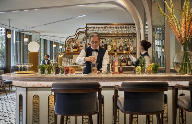
New York’s iconic Crown Building will reopen its doors as Aman, New York. The new hotel boasts 85 elegant suites and 20 private exclusive residences, including a five-story, unique penthouse. It’s been designed by the celebrated architect and longtime Aman collaborator Jean-Micheal Gathy, who has remained true to the Crown’s original architecture while paying homage to the brand’s Asian roots. Guests can access incomparable facilities ranging from three fine dining options, including Nama, the signature venue for Omakase Washoku cuisine; Arva, a principal Italian restaurant offering all-day dining services; and the Wine Library which is the hotel’s premier wine cellar.
THE FIFTH AVENUE HOTEL, NEW YORK, USA
Another architecturally significant addition to this list (and another Big Apple addition), the new Fifth Avenue Hotel is a playfully restored historic building which finds a way to fit into the increasingly contemporary Midtown. The hotel’s 153 rooms, decorated vividly in jewel tones by Martin Brudnizki Design Studio, are spread out over two connected structures—the original McKim, Mead & White mansion and a 24-story modern tower. A 5000-square-feet ballroom with grand 22-feet ceilings, a 2500-square-feet private dining space and the multi-level Signature restaurant accompany the guest rooms. Guests can also access a two-story authentic library, study, fitness center, and an outdoor terrace with a breathtaking view of New York City.
ONE&ONLY, AESTHESIS, GREECE
The One&Only, Aesthesis is scheduled to open its doors to guests sometime in 2022 although an exact date hasn’t been released yet. The hotel is being developed on a 21-hectare prime beachfront property, appealingly surrounded by a forest reserve, with architecture that reflects mid-century principles. Guests can enjoy the iconic Athenian Riviera and a view of the locale’s crystal sea while being surrounded by the elegance of modern Greece. The hotel group has partnered with the wellness brand Chenot to create Chenot Spa at One&Only Aesthesis. The state-of-the-art fitness center further establishes the hotel as a premier resort for well-being.
ETÉREO, RIVIERA MAYA, MEXICO
The foundation of this new Mexican hotel was laid in a lush mangrove forest that stretches beside a white-sand beach. With 75 suites and studios, all with breathtaking ocean views, Etéreo will be one of the best ways to experience Mexico’s renowned Riviera Maya when it opens in December 2021. All suites and studios are accommodated with floor-to-ceiling windows, butler service, a private terrace, and plunge pools, making it the perfect place to relax and admire lush surroundings.
MONTAGE BIG SKY, MONTANA, USA
Montage Big Sky, the majestic mountain getaway, will be debuting mid-December 2021 to the tune of $400 million. The resort consists of 150 suites and guest rooms and 39 residences. Huge wooden frames and stone-accented surfaces throughout the hotel provide you with an elevated midwestern experience. An ideal location for both outdoor sports enthusiasts and nature admirers, the resort offers 5,800 skiable acres and a mountain paradise for adventurers wishing to visit Montana and Yellowstone National Park.
ROSEWOOD, DOHA, QATAR
Inspired by the nearby coral reefs, Rosewood Doha Hotel & Resort is going to be one of Qatar’s finest architectural landmarks. Housed within two striking towers are 185 guest rooms and suites, along with 173 serviced apartments and 300 residences. The hotel offers a dynamic range of cuisine with the opportunity to dine in eight innovative locations including the cigar lounge, bistro, coffee deli, lifestyle entertainment lounge, and three specialty restaurants. Sleek interiors and state-of-the-art technology bring this resort to new levels of sophistication.
THE REYKJAVIK EDITION, ICELAND
One of the few true five-star hotels in Reykjavik, The Reykjavik EDITION entered the luxury hotel market in November 2021. The hotel’s uniqueness lies in the ebony facade of its blackened Shou sugi ban timber, burnt using a traditional Japanese technique, and its dark grey steel frames which depict Iceland’s dramatic lava landscape. The urban hub houses 253 rooms, outstanding bars, a nightclub, a signature Icelandic restaurant, spa, and gym. The room’s floor-to-ceiling windows frame the scenic views of this up-and-coming capitol.
NOBU, MARRAKECH, MOROCCO
Nobu Hotel and Restaurant will open in the autumn of 2022 in Marrakech, Morocco, as announced by founders Nobu Matsuhisa, Robert De Niro, and Meir Teper. The 71 guest rooms and suites have been designed with an emphasis on combining Marrakech’s rich heritage with contemporary comfort. The hotel is of course home to some new additions to Nobu’s portfolio of renowned dining venues, as well as a 2000 sq. ft. spa, indoor and outdoor pools and a private event space.
THE AURUM, MOUNT TREMPER, USA
Brought to you by Steve Gold, The Aurum is a re-envisioned boutique luxury hotel and wellness destination spanning across 131 acres of mountainside. The hotel revolves around the Roman Hammam and Spa, a relaxing bathing experience that has never been seen in North American spa hotels until now. Featuring a style inspired by ancient Roman culture, the hotel houses 12 bungalows with private gardens each with jaw-dropping views of the Catskill mountains. When it comes to cuisine, the hotel promotes a holistic farm-to-eatery diet.
AIRELLES CHÂTEAU DE VERSAILLES, LE GRAND CONTRÔLE, FRANCE
Airelles Château de Versailles, Le Grand Contrôle is a first-of-its-kind hotel, located within the Château de Versailles – the royal residence of the old French monarchy. The 5-star hotel has 14 grand suites within a grandiose guest house originally built in the 1680s. Each suite is decorated in a style evocative of 17th-century design with a mirage of antiques and an abundance of floral motifs. The hotel indulges its guests at the Valmont spa and is home to mouth-watering delicacies prepared by renowned French chef, Alain Ducasse.
KISAWA, MOZAMBIQUE
Kisawa is an all-in-one eco-retreat located in the middle of a 300-hectare sanctuary, surrounded by an expanse of forest, dunes and beach. Showcasing minimalist decor with a modern touch, it offers 12 bungalows, each with a private beach, pool, outdoor kitchen, and a day area with an open-air deck. The bungalows have been built using innovative 3D sand-printing technology, commissioned specifically for this project to allow them to blend into the landscape and minimize their environmental impact. Your stay at any of the residences comes accompanied with a dedicated housekeeper and personal chef to tend to your every need.
MANDARIN ORIENTAL RITZ, MADRID
Located in Madrid’s famous Golden Triangle of Art, Mandarin Oriental Ritz is a historic five-star Belle époque hotel by the Mandarin Oriental Hotel Group. Opened after three years of extensive restoration, the hotel highlights 100 elegant rooms and 53 suites with natural light and classic-contemporary design. The suites are decorated with unique materials and classic designs that go best with their eye-catching structure. The hotel features a deluxe wellness center, steam room, indoor swimming pool, and a vitality pool. It is home to five restaurants and bars, with the cuisine prepared by the famous chef Quique Dacosta.
THE PENINSULA LONDON, ENGLAND
Overlooking Hyde Park Corner and the Wellington Arch, the Peninsula London is set to be one of the most prestigious on the London hotel scene. This 5-star hotel, expected to be inaugurated in early 2023, will provide the finest experience of British culture, art, and cuisine with renowned hospitality. It will feature 190 guest rooms and suites, and a colonnaded courtyard with architecture reflecting the heritage of Belgravia. The hotel’s unique peninsula spa will provide revitalizing beauty treatments to its guests. An array of cultures are represented in the cuisine on offer, incorporating Malay, Chinese, Indian Nyonya, and Srilankan street food for an experience like no other.
FOUR SEASONS, NEW ORLEANS, USA
Four Seasons New Orleans is set in an iconic 34-story tower designed by the modernist architect Edward Durell Stone. The hotel’s rooms consist of floor-to-ceiling windows that provide a serene view of the pristine Mississippi River, making it a gateway to access the vibrant culture of Cresent City. With the 17th floor of the hotel boasting presidential suites which contain a private office, gym and scenic views, this Four Seasons lives up to its highly respected name.
SAN DOMENICO PALACE, TAORMINA, ITALIAN
San Domenico Palace lies above Mount Etna, providing a breathtaking panoramic view in every direction. Finished with herringbone floors and marble bathrooms, the 111 rooms and suites provide a polished Italian finesse, whilst the principal rooms open onto sprawling terraces complete with a personal plunge pool and a heavenly view of the mountain, the Ionian sea and the ancient greek theatre. It is built on the site of the 14th-century Dominican convent, now enhanced with lush gardens designed by Italian landscape architect Marco Bay.
SIX SENSES SHAHARUT, NEGEV DESERT, ISRAEL
Integrated onto the cliffside, the Six Senses Shaharut opened in August this year, located in the southern region of the enchanting Negev Desert in Israel. Choose between an enviable suite facing the ever-changing colors of the Edom Mountains and the resort’s private reserves consisting of three-bedroom retreats, a pool and access to the Six-Senses Spa. Understated and earthy textures flow throughout the space offering a nod to the desert landscape and the country’s heritage creating the ultimate backdrop for relaxation.
RAFFLES LONDON AT THE OWO, ENGLAND
Situated in the iconic Old War Office, the latest Raffles flagship hotel is one that is steeped in history. Every effort has been made to preserve the architectural integrity of the grade II listed building and the result is magnificent. Transformed into 50 suites and 85 private residences, the hotel holds a ballroom, spa and no fewer than nine restaurants and bars in Raffles’ signature lavish style.
A BANYAN TREE ESCAPE, BUHAN, BALI
Having established a no walls, no doors policy, the Banyan Tree Escape offers guests a unique “naked experience” with the surrounding Balinese jungle. Each with their own mesmerizing views over Bali’s seven peaks, the hotel’s 16 villas are accompanied with private pools and open decks to allow unobstructed access to the melodies of the Ayung River. Providing a full immersion in nature without compromising on luxury, the hotel offers a truly unique experience. Inspired by local techniques and designed to reconnect you to nature, the Toja Spa affords an array of treatments performed with organic ingredients grown on the hotel’s on-site farm. A range of traditional experiences are also available for guests who want to delve into the Buhan culture. Purification ceremonies with local priests are designed to take you on a journey of enlightenment or enjoy a hike at sunrise and have your breakfast in “heaven” atop sacred Mt. Batur.
&BEYOND GRUMETI SERENGETI RIVER LODGE, TANZANIA
Promising the “ultimate in exclusivity,” the Grumeti Serengeti River Lodge is set in the secluded western reaches of the Park increasing your chances for a unique glimpse at the Big 5. Having been renovated over the last year the reopening of this remote oasis offers ten luxurious suites, complete with private plunge pools, in-room massages and views of the hippo inhabited river. With the closest accommodation a far distance away, you are more likely to catch sight of a pride of lions than any fellow travelers on the twice-daily game drives included in this luxury experience.
JANU, MONTENEGRO
Janu, meaning “soul” in Sanskrit, is the highly anticipated sister brand to the Aman, aiming to provide profound relaxation, and restore lasting equilibrium for their guests. The Janu Montenegro will be the first of the brand to open, rooted in energy and exploration, the hotel hopes to encourage guests to stretch their boundaries and embrace the local environment. With opportunities for boat days and scuba diving, Janu promises both ultimate relaxation and vitality.
By Jonathan Holmes, Founder & CEO
Source: https://www.luxdeco.com/blogs/styleguide/new-hotels-to-visit-in-2022
DESIGN YOUR FUTURE TODAY!
Interior Designers Institute was founded in 1984 and is one of the few Interior Design Schools in California offering an Avocational Certificate Course, Associate of Arts Degree in Interior Design, Bachelor of Arts Degree in Interior Design, and Master of Interior Architecture Degree and is nationally accredited and also accredited by CIDA, Council for Interior Design Accreditation.