These Will Be the Hottest Paint Colors in 2020, According to Behr

Article by Marisa Spyker, from Coastal Living Magazine.

If you’re still pumped over Pantone’s energetic pick for their 2019 Color of the Year, Living Coral, now is the time to come back down to earth. ‘Tis the season for 2020 color forecasting (yes – already!) and, if there’s one thing we can glean from Behr’s brand-new paint color preview, it’s that the coming year will be filled with hues that remind us of the great outdoors.

Photo from livable.com

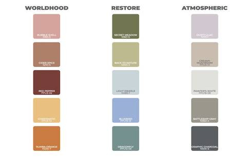
The paint giant recently released a trend-driven collection of 15 shades they’re predicting will take over interiors in 2020. Divided into three palettes—dubbed Worldhood, Restore, and Atmospheric—the hues range from balanced neutrals and earthy greens to “lavish oranges.” “The new palette sources inspiration from the desire to engage with the world around us and restore balance in our everyday lives,” says Behr in a press release.

Photo from behr.com

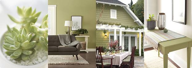
Back to Nature paired with Battleship grey is a stunning combination that has a very organic feel and can be used in many spaces.

Photo from Kitchenstudioofnaples.com

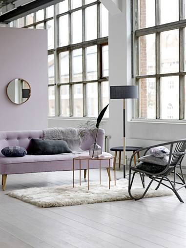
Dusty Lilac is a soft color that gives a subtle punch of color and can be a great accent color.

Photos from Pinterest

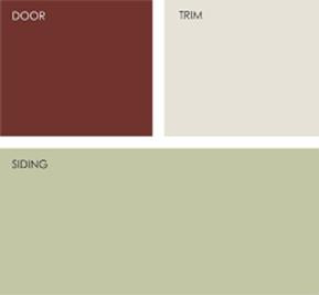
Red Pepper is a strong statement color that can also be used as an accent color paired with softer colors.

Interior Designers Institute is proud to announce it is an ACCSC School of Excellence Award recipient.

This award recognizes ACCSC-accredited institutions for their efforts in demonstrating a high level of achievement among their students and a commitment to the accreditation process.

The ACCSC School of Excellence Award is intended to recognize ACCSC-accredited institutions that have demonstrated a commitment to the expectations and rigors of accreditation as well as efforts in maintaining high levels of achievement among their students. In order to be eligible for the School of Excellence Award, an institution, minimally, must go through the accreditation process without issue, pay all fees and submit all reports on time and complete, and a majority of the school’s graduation and employment rates from all programs offered must meet or exceed the average rates of graduation and employment among all ACCSC- accredited institutions.

ACCSC has determined that Interior Designers Institute in Newport Beach, California, has met the established criteria and shall receive a 2018 -2019 ACCSC School of Excellence Award.

Meet Lisa McDennon, IDI Graduate, IDI Excellence in Design award winner & Accomplished Interior Designer

Today we welcome Lisa McDennon of Lisa McDennon Design www.lisamcdennon.com and NUANCE Home Boutique www.nuance-home.com. Both based out of Laguna Beach, CA. In this episode we discuss the synergy between designers, builders, and architects.

We talk about how Lisa achieves her signature refined and sophisticated design style and we discuss her recent collaboration with HINKLEY LIGHTING and how it almost didn’t happen.

Click Here to listen to the Podcast.

COLOR TREND ALERT TEAL

Photo from Architecture Lab.

Article courtesy of colorpsychology.org.

Teal is a medium to deep blue-green color. It is made by combining blue and green pigments into a white base. The soothing blue-green shade evokes tropical lagoons and dense jungles.

From oceans to peacock feathers, teal is a common sight in the natural world. Polls show that blue and green are Americans’ favorite colors, and teal is the happy medium.

Teal is often used in logos, web design, and interior decorating–especially in the bathroom, library, and living rooms. The hue is an interior design staple because it adds a sophisticated splash of color to a neutral room. Not as bright as turquoise or as basic as blue, it contrasts nicely with coral, maroon, and gold. Teal can also be seen in a lot of pottery, jewelry, and Southwestern-style textiles.

Photo from Bethan Gray Design

Psychology of Teal: Teal blends blue’s tranquil stability with green’s optimism and healing properties. Teal is the color of restfulness and mental and spiritual balance. The calm shade has a natural dignity that is not contrived or “in your face.” Teal’s understated elegance encourages a calm, reflective mood. Brighter teal tones are unique and smart.

People who like the color teal are reliable and independent individuals. They are naturally creative and think for themselves. A teal lover has an even temper and a thoughtful disposition. He or she likely has a talent for mediation and finding a compromise. On the other hand, people who are attracted to teal can be pretentious and prone to over-thinking every situation. They may think too much instead of acting on their desires.

ROCKETMAN Set Decor

“The idea,” says Director Dexter Fletcher, “was to create something that would genuinely explode off the screen, a riotous joy-ride of imagination, celebration and drama.”

They toured Elton John’s Windsor house and met with him early on re: the look of the film, as he was not only the subject but also one of the producers, along with his husband David Furnish. Farr was impressed with the icon’s openness to their creativity, his preference that they not religiously re-create his environs, but “surprise” him with their interpretations.

Thus, while Elton’s childhood home has that beiged-down vintage realism [and an opportunity to use truly vintage wallpaper and fabrics!]…

Her sense of whimsy and wide perspective has allowed her to build a network of what she refers to as “mad collectors” of vintage items.

There are a huge number of sets, from the local pub to posh London eateries, a range of offices and homes, private jet plane to crowded dressing rooms, and, of course, the stage shows, from The Troubadour to Dodger Stadium!

Meet Wendi Young, IDI graduate and the recipient of the 2019 IDI Excellence in Design Award

With over twenty years in the design business, Wendi, along with her talented design team, has completed hundreds of full scale interior design projects for clients near and far.

Wendi has witnessed first hand the transformation of the design industry and has responded both creatively and from a business perspective with acceptance and innovation. Her thoughtful approach to business and design has served her well over the years and her message today is both thought provoking and inspiring.

Click Here to listen to the Podcast.

Design Your Break

If you’re reading this it’s likely that an attempt to get away from the everyday required data gathering or task completion work in your life is very intentionally on hold. Humans need breaks1 and although we often do this at the expense of anything productive, it is possible to get a break without losing touch with our work focus. You may be surprised to find that a break related to what you are working on can be as effective a refresher as one that completely isolates you from it2. With this in mind, let’s take a look at three design related breaks that will allow those of us who wish to maintain a sense of productivity also gain the benefits of a good break.

First, Francis Andertons Design and Architecture3 is Los Angeles’ podcast/radio show for the latest in LA design. You might find her list of design things to do this week a great way to fulfill your break needs with productive content.

Second, spend some time with a TED4 talk. You may have heard of TED before now, not realizing that it actually stands for Technology, Entertainment, and Design. Head over to this fabulous website, select Design under topics, and prepare for one fascinating break.

Finally, Dezeen5 magazine is a great choice if your preferred break consists of inspiring photos of our colleagues most current leading projects. Upon arriving at Dezeen’s homepage choose Interiors and then set a timer as this break may go longer than you planned.

1) https://www.dezeen.com/

2) http://www.neeley.tcu.edu/uploadedfiles/academic_departments/management/its_the_little_things_that_matter.pdf

3) https://www.kcrw.com/culture/shows/design-and-architecture

4) https://www.ted.com/talks

5) https://www.dezeen.com

What’s New in Restaurant Paint Color Palettes and Design?

Delicious insights about dining design from commercial designers across the country.
Credit: Article and photos from Sherwin-Williams.

Forget starched white tablecloths and muted palettes. Today, restaurants are designed to entertain, to surprise, to create Instagrammable moments — and color plays an essential role. Branding, mood, day-to-night ambiance and the personality of the chef or owner all give a restaurant its custom look. We spoke to nationally known commercial designers to discover the trends they’re creating.

Natural Materials
Natural elements like wood and slate are very popular right now, according to Hannah Weiner, interior designer at Phase Zero Design in Boston.

“The trend is to create cozy, rustic, authentic spaces that lend an almost ‘mom and pop’ feel,” she says. “The effect is created by starting with 85 percent of neutral colors — mostly black contrasted with grays and whites. Once that neutral palette is laid, pops of color are added on accent walls, banquettes, upholstery, pillows and wall décor to give the space a warm feeling.”


Crack’d is a culinary-driven eatery in Andover, Massachusetts. Phase Zero Design incorporated a “mom and pop” vibe by utilizing murals, grays and pops of color.

Muted Pastels
Tanya Spaulding, principal at Shea Design in Minneapolis, sees restaurant design color going from an industrial, dark and heavy vibe to a lighter, more colorful one.

“Designers have been using gray as a primary base for restaurants for a while now, but I’m seeing that transform into muted pastels instead,” she says. “Incorporating these colors into smaller areas, like on a private dining room wall or on pillows, provides energy and life to a space, and can easily be updated every few years for a fresh look and feel.”


Benedict’s is a breakfast diner in Wayzata, Minnesota. Shea Design specified muted pastels to evoke a midcentury style.

Plants
Another trend restaurant designers are seeing this year is the icorporation of indoor plants.

“The trend is to create cozy, rustic, authentic spaces that lend an almost ‘mom and pop’ feel,” she says. “The effect is created by starting with 85 percent of neutral colors — mostly black contrasted with grays and whites. Once that neutral palette is laid, pops of color are added on accent walls, banquettes, upholstery, pillows and wall décor to give the space a warm feeling.”

The “Artichoke” Lamp

PH lamps are iconic and were designed by Poul Henningsen for the Danish lighting manufacturer Louis Poulsen, founded in 1874. The PH lamp might be more familiar to you as the “Artichoke” lamp which is now commonly called the PH Artichoke lamp. Midcentury Scandinavian furniture, such as the PH Artichoke lamp, helped define the look of an era.

There are many versions of the famous artichoke lamp. The shades or lens of the lamp make it unique because Henningsen was the first designer to create a lamp with lens to deflect direct light. It is remarkable to know that the PH Artichoke lamp, created in 1958, still looks so futuristic in 2018. The lamp has 72 perfectly positioned leaves forming 12 rows of leaves emitting a lovely diffused light.

Henningsen was not only a designer but also a journalist, critic, and editor. His lamps won Gold medals in the International Exhibition for Decorative Art held in Paris. The now-legendary PH lamp is available with a three shades system. It comes in many contemporary finishes with the original style now costing a little under $12,000.

The vision of Henningsen is remarkable. He created a lamp that was futuristic looking in 1958 and is still futuristic looking in 2018. And he is one of many great designers who created lighting, furniture and architecture with a profound vision. Follow this blog for the discovery of more visionary designers.

*Photos courtesy Poulsen

Barcelona Chair

The iconic Barcelona chair was designed in 1929 for the Spanish Royal Family by the German designer Ludwig Mies van der Rohe. The form is thought to be inspired by the Roman folding chairs known as the Curule chair. Although many architects and furniture designers of the Bauhaus era were intent on providing well-designed homes and impeccably manufactured furnishings for the “common man,” the Barcelona chair was an exception.

In 1950, Mies redesigned his old Barcelona chair using modern techniques which allowed the frame to be molded from a single piece of stainless steel rather than being bolted together. The original pigskin seat was replaced with cow leather. The chair was then taken up by Knoll, who still produces it to this day. Even though it is a mass-produced item, the upholstery consists of 40 individual panels from a single hide, so it has the qualities of a hand-made piece, which goes some way to accounting for the higher end pricing.

Since 1953 Knoll Inc has manufactured Barcelona chairs. They make the frame in two different steel configurations, chrome and stainless.  This chair is one of the most recognized objects of the last century, and an icon of the modern design movement. I’m sure you have seen it in homes and magazines. The Barcelona chair comes in many colors but the black leather remains the most popular. Follow our blog to learn more about iconic furniture designers.